AHN brands and logos
When branding AHN materials, use the most specific logo possible. If the message or service is tied to an Institute or a physical location, use that logo. If it’s a system-wide message, service, or general information, default to the base AHN logo to avoid branding out multiple versions of the same document.
Using generic branding can also help bring focus to the logo mark in small-space or copy-heavy cases where specific branding doesn’t fit.
For each new or updated piece, always pull assets from the logo library, which is updated regularly and with the most up-to-date versions.
For information on using the AHN and Highmark logos together, go to the AHN and Highmark Joint Logo design standards page.
Download AHN logos below:
AHN LOGO

Use our primary logo with care, maintaining the proportions of all its elements.
CLEAR SPACE / MINIMUM SIZE
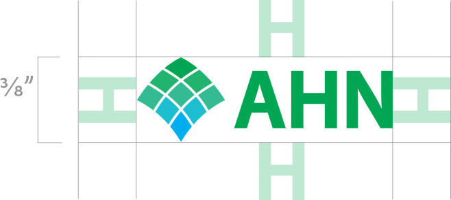
Use the “H” height from our mark to determined minimum clear space. Maintain clear space proportionately as the mark is enlarged or reduced in size.
ALIGNMENT

Preferred mark location is on the left side of the page.When aligning the mark with any text or objects above and below, use the left vertical of the “H” as the alignment point. Ensure the edge of the swoosh is at least an “H” height away from the page edge.When used with a left-aligned URL, hashtag, or CTA, right-align the mark with objects and text aligned with the bottom of the cross and shield.
USE


For knocked-out versions, use the background color for cross and shield details.
Background colors or imagery should be as dark as possible to maximize contrast.
Do not use knocked-out versions on a busy background that will obscure the mark.
Do not apply a drop shadow to the marks.
Do not use alternate colors for any part of the mark.
Color system
It starts with blue. In our lives, it means security and trust. In individuals, it evokes friendliness and reliability.
We mix in darker shades to connect tradition and quality. We bring in brighter tones to reinforce innovation and technology.
Combined with greens for health and pastels for lightness, our palette helps us portray anuplifting, vibrant, forward-thinking brand.
PRIMARY
AHN GREEN
PMS 2257 C
CMYK 79, 2, 85, 0
RGB 24, 175, 96
HEX #0CB161
HIGHMARK BLUE
PMS 2184 C
CMYK 94, 29, 0, 0
RGB 0, 141, 209
HEX #008DD1
TOGETHER BLUE
PMS 7694 C
CMYK 100, 57, 9, 52
RGB 0, 57, 99
HEX #003963
DEEP CORAL
PMS 2344 C
CMYK 0, 49, 48, 0
RGB 247, 152, 125
HEX #F7987D
SECONDARY
SHADE GREEN
PMS 7484 C
CMYK 89, 11, 84, 39
RGB 0, 109, 65
HEX #006D41
SWOOSH BLUE
PMS 2995 C
CMYK 90, 11, 0, 0
RGB 0, 162, 226
HEX #00A2E2
MIST GREEN
100% 50% 25%
PMS 2247 C
CMYK 39, 0, 33, 0
RGB 156, 213, 186
HEX #9CD5BA
BLUSH
100% 50% 25%
PMS 169 C
CMYK 0, 29, 23, 0
RGB 250, 193, 179
HEX #FAC1B3
BRIDGE YELLOW
100% 50% 25%
PMS 2002 C
CMYK 0, 0, 58, 0
RGB 255, 246, 137
HEX #FFF689
Typography
Clean and straightforward, our fonts reflect the brand’s uncomplicated approach. We rely on two typefaces for most materials: the geometric sans Sofia Pro and the old style serif Plantin MT Pro. Used together, they create distinction and visual interest.
For co-branded AHN and Highmark or internal Highmark Health materials, Highmark Sans can be used as a display-only font on a case-by-case basis.
